3. Wie konfiguriere ich die Button-Display-Einstellungen?
Erforderliche Jira-Rolle: Jira Software Administrator Bitte wechseln Sie zum zweiten Tab „Anzeigeeinstellungen“, um festzulegen, wo und wann der Button angezeigt werden soll:
Parameter
Syntax
Description
Source Projects
Project Picker Mandatory
Please select the projects where you want to place your button on the view screen.
Source Issue Types
Issue Type Picker Mandatory
Please select the issue types where you want to place your button on the view screen.
✓
The list of issue types is restricted to only those relevant to the previously selected projects.
Filter (JQL)
JQL Expression Optional
You can add an optional condition for displaying the button by defining a JQL (Jira Query Language) statement. Please make sure the JQL statement is correct and that, together with the selected source projects and source issue types, it leads to meaningful results.
✓
The JQL statement syntax is checked by the app.
Filter (JQL)
asasasasas
Error in the JQL Query: Expecting operator before the end of the query. The valid operators are =, !=, <, >, <=, >=, ~, !~, IN, NOT IN, IS and IS NOT.
Permissions
Picker Optional
You can add an optional condition for displaying the button by defining specific permissions. Please select first the permission type:
Permissions
Select... ⌄
Groups
Users
Project Roles
The app will list you all valid parameters, and you can select one or several values:
All configured display settings must be true before the button is displayed. The app checks your Jira instance in real time using the Atlassian standard API. Atlassian sometimes shows changes (e.g., in user groups) with minor latencies. Additionally, the response time of the Atlassian API impacts when the button is checked and can be displayed, which can take several seconds.
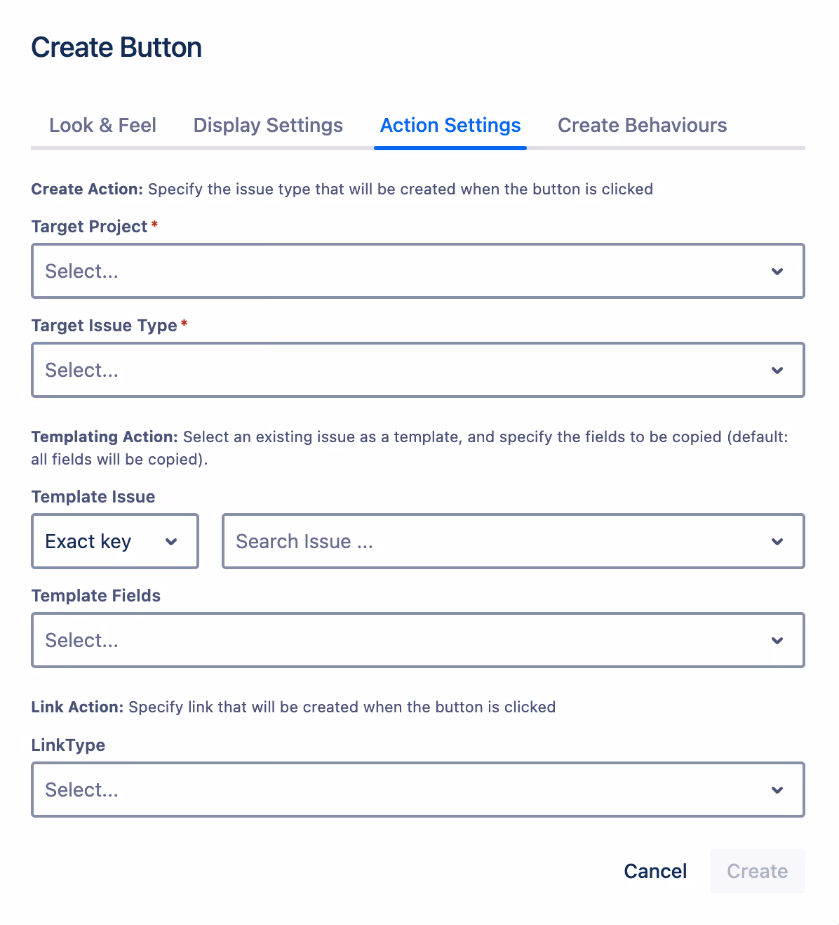
4. Wie konfiguriere ich die Button-Aktionseinstellungen?
Erforderliche Jira-Rolle: Jira Software Administrator Bitte wechseln Sie zum zweiten Tab „Aktionseinstellungen“, um die Button-Konfiguration abzuschließen, und konfigurieren Sie, welcher Problemtyp erstellt und verknüpft werden soll:
Parameter
Syntax
Description
Target Project
Project Picker Mandatory
Please select the project from which you want to create and link issues.
Target Issue Type
Issue Type Picker Mandatory
Please select the issue type from which you want to create and link issues.
✓
The list of issue types is restricted to only those relevant to the previously selected project.
Template Issue
Issue Picker Optional
Select an existing issue as a template. The fields of this issue will be prefilled automatically in the creation screen.
You can select the issue by entering the exact issue key:
Template Issue
Exact key ⌄
Template Fields
Select...
TEMP-1 ⌄
TEMP-1 Bug-Template: Please enter a clear Bug Summary: What is exactly is wrong
Or by searching the issue summary and selecting one result:
Template Issue
Summary ⌄
Template Fields
Select...
Bug-Template ⌄
TEMP-1 Bug-Template: Please enter a clear Bug Summary: What is exactly is wrong
CL-47 Bug-Template: Please enter a clear Bug Summary: What is exactly is wrong
Template Fields
Field Picker Optional
Default: All relevant fields will be copied if they exist in the template issue.
Once a template issue has been selected, you can narrow down the fields to be copied in the creation process to a subset. We will list exactly the fields that will be used in the creation screen of the configured target project and target issue type.
Template Fields
Components ×Test Repository Path ×⌄
Assignee
Test Type
Cucumber Test Type
Cucumber Scenario
Generic Test Definition
Manual Test Steps
Test Sets association with a Test
Pre-Conditions association with a Test
Test Plans associated with a Test
Link Type
Link Picker Optional
Default: No Link
Choose the type of link that should be established between your source issue and the target issue after the creation action.
i
Our Issue Template Feature leverages the capabilities of the Atlassian Forge Platform, providing full support in Software and Work Management projects. However, when used in Service Management or Product Discovery projects, some limitations may arise, such as restrictions on custom fields and UI modifications. See Atlassian Forge Platform Limitations.
4. Wie konfiguriere ich den Button — Create Behaviours?
Erforderliche Jira-Rolle: Jira Software Administrator Bitte wechseln Sie zum zweiten Tab „Create Behaviours“, um die Button-Konfiguration abzuschließen, wenn Sie Behaviors zum Create-Bildschirm hinzufügen möchten und lesen Sie die Dokumentation hier:
.svg)
.svg)

